Time for tea

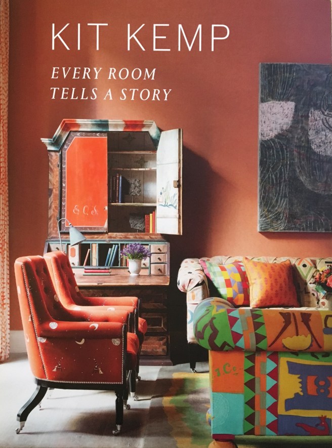
The other day we visited Mimi’s Picnic Parlour in Edinburgh (an offshoot of Mimi’s Bakehouse) – isn’t that a great name for a coffee shop? It only has three tables because it specialises in cakes to takeaway, hence the ‘picnic’ bit. And the cakes (and the blondes and the brownies and the tray bakes and the scones…) are amazing. You can check them out here, as well as the delicious savoury goodies, and be thankful that calories and carbohydrates can’t travel through the internet!

Anyway, although it is a very small space they have decorated it in a charming and slightly eccentric style, in keeping with the other branches. First, there are two of these delightful light fittings:


IMG_0824

IMG_0857


As you can see, they are wire lamp frames which have been decorated with little birds. You can also see that there is no actual bulb in there – probably a good idea from a safety point of view if you were thinking of having a go at making something like this, so you’d need to make sure that fitting wasn’t actually needed as a light source. Here there is a large window and some recessed spotlights in the ceiling.

There is also this wallpaper:

FullSizeRender


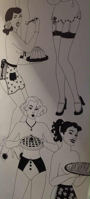
It’s by Dupenny and is called ‘Time for Tea’. It’s a wallpaper that grabs the attention and as Mimi’s Picnic Parlour is small, they have wisely used just one panel of it so it doesn’t dominate the space. (It’s also positioned rather discreetly so that it can’t be seen from that large window we mentioned)!

So the clever ideas don’t just stop with the baked goods! If you are in Edinburgh and fancy dropping in to sample the delicious food served by charming staff,  you can find Mimi’s Picnic Parlour at 250 Canongate, Edinburgh, EH8 8AA.

So. Pastels.

It’s clear that pastels are a thing at the moment – Pantone has named not one but two as ‘colour of the year’ and when we talked to Rebecca from Georgia Victoria a couple of weeks ago, pastels were one of her tips for the coming year. But you know what? We’re kind of on the fence for this one.

For the first year ever Pantone has chosen a blending of two colours as ‘colour of the year’ – Rose Quartz (described as an ’embracing rose tone’) and Serenity, a ‘tranquil blue’.

press_coy2016

They are described as ‘a harmonious pairing of inviting shades that embody a mindset of tranquility and inner peace’ and, according to Pantone, reflect a yearning for reassurance and security in response to the stress of modern living.

Well, they are certainly pretty colours. And can be very useful for decorating – either pair well with greys, greens, plums and beige-y neutrals. Neither of them is difficult in the sense of demanding attention or draining life from other colours. Few people will have a passionate dislike of either.

And that’s the problem really. They are a bit safe. Now usually we are all for safety (and please watch that coffee pot, it’s hot!). Safety is good. A healthy respect for safety is how our ancestors didn’t get eaten by sabre toothed tigers. And our homes should definitely be safe places. But we can’t help feeling that our homes should be safe so that our imaginations can take some risks. It’s OK to pick a bright colour; choose a dramatic fabric;  surround yourself with unusual objects you love!

So that’s what it comes down to really. There’s always a place for pastels, but we think you should use those safe colours with caution!


‘Every Room Tells A Story’

Recently we were lucky enough to be given this lovely book, which just came out in November:

IMG_0626

Kit Kemp is an award-winning designer who co-owns the Firmdale group of London and New York hotels. This is her second book, a follow up to ‘A Living Space’ and reflects her belief that “A great space need not be the most glamorous or luxurious – it is how personal and interesting you make it”. (Although we have to say that her spaces manage to be quite glamorous and luxurious as well!).

The most striking thing about the interiors is that whilst they don’t feel cluttered, they are packed with things that catch the eye. Ceramics, folk textiles, antiques, mud bead chandeliers, bowling shoes, wooden crocodiles and fabulous wallpaper (you know how we love a fabulous wallpaper) all exist happily together. They are sourced from artists and artisans all over the world and Kit herself has worked on collections for Wedgewood, Christopher Farr, Chelsea Textiles and Anthropologie.

IMG_0630

The wallpaper in the picture above is Nuvolette from the Fornesetti II collection for Cole & Son. The room is at the Haymarket Hotel in London.

There’s a great feeling of space in the rooms. One of the main reasons that it is possible to pull this off in combination with so many fascinating objects is the selection of a subtle theme linking adjoining spaces and discipline in the choice of the individual items. Often the theme is colour. Love the combination of navy blue and hot pink in this bedroom at the Dorset House Hotel:

IMG_0628

It’s striking and restful at the same time – which is a great combination for a boutique hotel bedroom! The lamp is just the right size for the small space and seems to disappear into the background while the purple flowers are the perfect colour. (Try imagining them any other colour and see how that wouldn’t work!)

The book also features the idyllic house in the Caribbean that Kit designed for her own family:

IMG_0627

The book (published by Hardie Grant Books in the UK) is beautifully produced and full of pictures to enjoy. Definitely our recommendation if you are looking for some new ideas for 2016!


Cracking good idea

Box image 1

This is something we discovered recently – personalised fortune cookies! What a great idea for parties, wedding favours or as a gift. They’re made by a company called ‘Cracking Cookies‘ who make 17 different flavours (that’s a bit of a revelation in itself because previously we’d only had, well, fortune-cookie flavoured ones). As well as ones like vanilla and chocolate there are more adventurous flavours such as coconut lime and black pepper and salted caramel and banana. And they can be truly personalised, so if you order a box of, say, 6 you can have 6 different messages on them.

General 41

Cracking Cookies can also supply traditional messages if you prefer, or even ‘Un-fortunate fortunes, which say things like ‘ Good fortune is coming your way in the form of a bag of gold coins………………… Chocolate coins that is!’ There are also themed ranges for birthdays, anniversaries, new babies and to say ‘thank you’ or ‘congratulations’ and Cracking Cookies offer a bespoke service for wedding fortunes. You can even have entertainment cookies which have contain challenges, charades or conversation topics.

Makes us want to have a party just so we can order some!

Strawberry and Cream Fortune Cookie

(All pictures used with the kind permission of Cracking Cookies, who retain all copyright.)

The new bottle lamp

P1040043

We bought this little thing the other day. It’s called a bottlelight – it’s a cork-sized LED that fits in a bottle to turn it into a light! Remember when people turned wine bottles into lamps and they looked like this?

Embed from Getty Images

No? You’re so young! Well, take it from us, it used to be a thing. Anyway, one of the problems was that the lamps had to be plugged into the mains so there was always the issue of how you made a hole in the glass for the cable to pass through. But this little thing just sits in the neck of a bottle and can be recharged using a USB port or charger. So this is what we did:

P1040046

(Please note – no lampshades this time round!) The bottle used to contain Gingerella ginger ale which is a delicious non-alcoholic drink made with Fair Trade ingredients by Karma Kola. You’re right of course – it did take seconds to make. But we are still pleased with the result! No problems with quick and easy here!

A revelation in the bathroom…

Thanks to a gift from lovely (and very generous) friends, we have had a revelation in the bathroom. They gave us these hammam towels:

P1040035Now, we had seen these before because they seem to be quite fashionable at the moment but to be honest, thought that they didn’t look as if they would be very absorbent or, well, cosy. And those are really the main qualities that towels need to have. But now we had the perfect opportunity to try them out so we did.

And they are wonderful. The thing we hadn’t realised is that the more you use them, the softer and the more absorbent they get! Plus there is the added bonus that they are thin, so they don’t take up much room and they dry really quickly – which makes them ideal for the beach or the gym. (Because that’s what was stopping us getting to the gym – not having the right kind of towel, but that will all change now! Definitely.)

At the moment Achica has some lovely Ikikiz beach sets, like  this one:

1786-2KZ_1

So we are quite happy to have had a revelation in the bathroom and will be using our new knowledge at the gym and the beach too!

What a great idea, Nora Fleming!

We saw some Nora Fleming tableware the other day – what a great idea! All the items are plain white with one tiny hole somewhere on the edge. Like these: P1040029 And into this tiny hole goes one of a range of ‘minis’: a ceramic embellishment. There are minis for every season and occasion so your plate or bowl or serving dish or bread tray can change with the theme of the event. As as well as being very stylish it is cheaper and takes less space than having a specific platter for each one. Isn’t that clever? Here are some of them: P1040030 P1040033P1040031 P1040032 And apparently, there are more coming soon. The not-so-good news is that you can only buy Nora Fleming tableware in the USA and Canada at the moment, but it is such a simple and fun idea that we wouldn’t be surprised if it gets an international market soon!

A visit to The Kelpies

A kelpie is a Scottish water spirit, who usually appears as a horse. But Andy Scott’s Kelpies are a pair of sculptures that since April 2014 have stood 30 metres above the entrance to the Forth and Clyde Canal in Falkirk, Scotland. You can glimpse them from the road nearby, but that doesn’t really do them justice. Up close (and you can walk right up to  them and even, on a guided tour, inside them) they are spectacular.

Andy Scott is a Scottish sculptor who specialises in public art and his work can be seen in England, Northern Ireland and Australia as well as Scotland. The Kelpies’ maquettes (smaller, preliminary works – in this case 1:10 scale) have also been exhibited in the US, most recently in Bryant Park, NYC. Interestingly, he was given the title ‘The Kelpies’ to work with right at the start of the project, rather than it being something decided retrospectively. Andy then developed the idea from its beginning in mythology to something which encompasses the idea of the horse as the driving force of the early industrial revolution – including of course the heavy horses that pulled the canal boats when the canals first opened. (Two Clydesdale horses called Duke and Baron were the actual models.) Each sculpture weighs 300 tonnes and is made of 990 stainless steel plates.

P1030874

The Kelpies are not without  their detractors. Jonathan Jones writing in The Guardian (22/4/14) called them ‘banal and obvious’, saying that they are ‘neither well observed nor powerfully imagined’. But if we may be so bold (and you know that we are not usually controversial), we think that he is missing the point as he sees them as sculptures of horses.  But they are not horses, they are kelpies and they say something  about our relationships with water, earth and industry. We think they do it very well indeed.

Graffiti

P1030861

We’re not usually big fans of graffiti. That’s partly because although everyone has the right to self-expression, everyone else has the right to a) not be interested and b) not have their property damaged. And it’s also because for every Blek le Rat there are a gazillion people who aren’t making urban art statements, but just have a spray can.

But a few weeks ago some uplifting graffiti appeared near us – like the example above. And this one:

P1030863 - Version 2

And this one:

P1030862 - Version 2

People have been noticing them and smiling, which is always a good thing. And there’s something else. As you can see, the writing is in chalk, which is very easy to wash off. But they have all been up for a couple of weeks – which, we like to think, means that the owners of the buildings they appear on have chosen not to do so. Instead they are leaving these little messages where they are to make people smile as they go about their business.  And although, as we said, we are not big fans of graffiti, it’s difficult not to see the good in that. And who can complain about this one?

P1030864 - Version 2