So. Pastels.

It’s clear that pastels are a thing at the moment – Pantone has named not one but two as ‘colour of the year’ and when we talked to Rebecca from Georgia Victoria a couple of weeks ago, pastels were one of her tips for the coming year. But you know what? We’re kind of on the fence for this one.

For the first year ever Pantone has chosen a blending of two colours as ‘colour of the year’ – Rose Quartz (described as an ’embracing rose tone’) and Serenity, a ‘tranquil blue’.

press_coy2016

They are described as ‘a harmonious pairing of inviting shades that embody a mindset of tranquility and inner peace’ and, according to Pantone, reflect a yearning for reassurance and security in response to the stress of modern living.

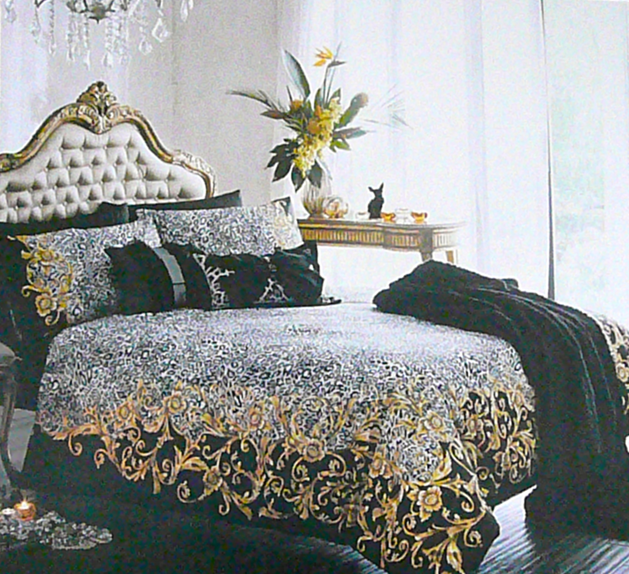
Well, they are certainly pretty colours. And can be very useful for decorating – either pair well with greys, greens, plums and beige-y neutrals. Neither of them is difficult in the sense of demanding attention or draining life from other colours. Few people will have a passionate dislike of either.

And that’s the problem really. They are a bit safe. Now usually we are all for safety (and please watch that coffee pot, it’s hot!). Safety is good. A healthy respect for safety is how our ancestors didn’t get eaten by sabre toothed tigers. And our homes should definitely be safe places. But we can’t help feeling that our homes should be safe so that our imaginations can take some risks. It’s OK to pick a bright colour; choose a dramatic fabric;  surround yourself with unusual objects you love!

So that’s what it comes down to really. There’s always a place for pastels, but we think you should use those safe colours with caution!


Colour dilemma…

This week we’re having a bit of a colour dilemma, caused by our ongoing love of bed linen.

You might remember that a while ago we got some new bedroom curtains – so that’s got to be an excuse to get some new bedlinen, right? The trouble is that we couldn’t find quite what we were looking for. There were lots that were lovely but nothing quite right. We were trying for something that had a kind of tongue-in-cheek, old school glamour. Maybe dark to offset the cream curtains? Maybe a bold pattern because the bed is the focus of the room? Maybe something heading towards the top even if not actually going over it? And then we saw this (and then, like you’d expect, we waited until the sale to get a bargainacious 50% off).:

P1030856

P1030854

So that’s the cover sorted, but here comes the dilemma – what colour sheets? In the picture the sheets are black, but aren’t black sheets a little… Austin Powers?

Embed from Getty Images

 Each to their own an’ all (and it was a great movie) but that’s not quite the look we want.

So what colour? As a general rule, you can’t beat white sheets but we think white will look too stark.

So what colour? As a general rule, you can’t beat white sheets but we think white will look too stark. Yellow? Hhhmmmm. Maybe it’s time for a lie down while we think about it. We’ll let you know what we decide!

Framed!

Do you remember Cecelia? The Dan Hillier print we bought a while ago? (Here is a link to the post about it).

P1030687

Well, we finally got round to taking her to the framing shop.

First step was to chose a mount – easier said than done. Our first thought was that it should be a pale grey, but in practice all the greys were too dark and actually looked more like blues against the print. Luckily the shop had a range of different colours:

P1030809

But even opting for white mean that there were still decisions to take – some of the whites looked too yellow or too pink against the print. And the one that was the brightest white…well, it looked too white! Eventually we chose the one on the left in this picture:

P1030807

That one is called ‘French White’, which has a suitably sophisticated ring to it! (Please note that it is not Ice White, Goosedown, Polar White, Spanish White, Matte White, Igloo, Frost, Fairfield White, Cobblestone, Almond or Photo White – and those are just the ‘white’ colours from the same manufacturer. There are others, with different colours of white mount card!

But the colour of the card wasn’t the only decision to be made about the mount. We also had to decide whether to have the print window mounted, or float mounted. Window mounted is the more traditional of the two – the print sits behind the mount, which has a ‘window’ cut out so that the print can be seen through it. Float mounting puts the print on top of the mount so that the edge of the print is visible. It’s usually used with a box frame so that there is some physical depth to the finished picture. We went for window mounting for two reasons. One is that the edge of the print is just a straight cut and not particularly interesting in itself. The other is that Cecelia’s headress (or is it her hair? Or her feathers?) fills the top of the print and we didn’t want to take away from that affect. That’s also why we chose to have the mount go straight up to the edge of the image rather than leave a few millimetres  of the paper outside the print showing. The borders will be slightly narrower at the sides than they are at the top and the bottom.

So finally, the frame.  Once again, there was quite a choice:

P1030810

The plan was to get something plainish, but not too plain, with a silver-gilt colour. With some help we settled on this one:

P1030808

So that’s all the decisions made and now we just have to wait 7-10 days until she is ready for collection. Thank you very much, Framework Picture Framers, for all your help and advice!

Some words about colours

Embed from Getty Images
What colour is this flower? It’s yellow, right?  We thought so too! But we heard something mind-blowing the other day. Did you know that ‘pink’ used to mean ‘yellow’? Us neither. How can pink be yellow? Apparently, it’s because there is a German word ‘pinkeln’ which means to urinate (we know – this isn’t the kind of thing we usually talk about). In the past, walls were often covered with distemper, a kind of whitewash, which could be coloured. The distemper was sold in powder form and mixed up when needed – except for a yellow colour, which was sold as a liquid, hence being associated with ‘pinkeln’ and so ‘pink’. This was convenient and popular but over time, the most popular colour became a kind of pale red and the name stuck. There is also an artists colour called ‘Dutch Pink’ which is a light greenish yellow. In more recent times, ‘pink’ as a description of a colour is generally thought to refer to the flower dianthus, which is also known as a pink. They became popular in the seventeenth century, round about the time that the word pink became generally linked with the colour we associate it with now.

Embed from Getty Images
And something else we didn’t know – when people in the plastics industry talk about PVC ‘yellowing’ they don’t necessarily mean that the PVC has gone yellow because ‘yellowing’ can show as several colours, one of which is pink! (And this is not the same as ‘pinking’, which also turns the PVC pink but which results from a specific manufacturing process. We read these things so you don’t have to.) Oh – and maroon used to mean brown, not red. And auburn used to mean brownish white rather than reddish brown. Don’t even try and guess what blue used to mean…

Mauve

Screen Shot 2015-03-26 at 14.08.50

Another one of our occasional book reviews – Mauve: How One Man Invented A Colour That Changed The World by Simon Garfield (published by Faber and Faber, 2013).

William Perkins was a chemist in the 19th century who hoped to find a cure for malaria. He didn’t manage that but along the way he did invent the first aniline dye, a rich purple, in the 1856 when he was only 18. (So young that the patent rules of the time had to be changed to let him register his discovery). Mauve immediately became the fashionable colour and was popularised by Queen Victoria. (Incidentally, the Victorians pronounced it ‘morv’ rather than ‘mowv’.)The discovery of a purple dye in itself might not seem hugely important, but it was a development that had huge effects on industry, academia, politics, photography, medicine, warfare, forensic science… and now Perkins is largely forgotten.

It’s easy to take for granted the huge range of artificially created colours that we see everyday so this book offers an interesting chance to reflect on how different things were before their discovery. (And you might be interested to know that it doesn’t assume that the reader has any knowledge of chemistry. We were!). It’s interesting to speculate about whether the world would seem more drab without artificial colour, or would the existing natural colours have stood out and their existence valued more?

The view from the fence

Can you remember back past Christmas and New Year to the beginning of December? We know, seems like ages ago. Back in the first week of December, Pantone (the colour systems and technology people) revealed tha18-1438 Marsala is its colour of the year 2015. They think, based on analysis of current trends in various areas that this is the colour we are all going to want for furnishings, interiors, design, fashion and beauty.
 
Pantone provides accurate colour references but basically it’s a rich, pinky-brown. Lots of people rushed to comment on this at the time, positively and negatively, but we were firmly on the fence about this one and seem to have stayed there for over a month!
First of all, some love it. They claim that it is a useful colour that works well with classic palettes of grey or camel or navy. It’s rich and inviting
Then again, some hate it on the grounds that it is reminiscent of kidneys or dried blood. And some think that it is old fashioned: a throwback to the 90’s or even the 80’s. (We did have some curtains that colour in the 90’s…)
We put some pictures on a Pinterest board so you can check it out yourself if you haven’t already come to a conclusion (and please leave a comment here if you would like to share any views). It can certainly look sumptuous for soft furnishings but it seems to give a traditional look and we’re not sure how well this could be used in a more contemporary setting.
Having given it some thought, there could be a clue in the language that Pantone uses about the colour. It’s described as:
‘equally appealing to men and women’
‘dramatic and at the same time grounding’
‘hearty yet stylish’
‘eye catching but not overwhelming’
having ‘sophisticated earthiness’
Now obviously, different colours can do different things, depending on how they are used, combined and lit – but that still seems like a lot of claims. Could it be that Pantone, based on the extensive research they do with designers all over the world, has been led to something it believes will appeal to all? Something that might even seem slightly familiar and safe? But some people’s familiar and safe is other people’s boring. As of today(8 January) the online poll at The Washington Post was split 48/52 against. (Love the way that they point out that it is not a scientific poll, just in case you were wondering!)
And we’re still not sure either. Just going to have to see what happens – like 2015 in general!
Happy New Year!
 

Happy Halloween!

It’s nearly Halloween! We love this mantel display because fun as it can be, Halloween is not always the most stylish or tasteful festival. Orange and black is a difficult combination to pull off, even without spiders, severed limbs and chocolate eyeballs!

So why orange and black? The black bit is straightforward – black means night and darkness. One theory about the orange is that it is the colour of undyed beeswax candles, which were used for church services on All Hallow’s Day to commemorate the dead. Another is that it is the colour of harvest and that with the black, it symbolises the end of the agricultural year, the ‘death’ of the earth and the darkness of winter. The reason that orange is a Halloween colour though is probably nothing to do with pumpkins…

Halloween originated in the Celtic festival of Samhain on 1st November, which was effectively a new year celebration but also a time when it was believed that the souls of the dead could come back to earth. The early Christian church made the same day All Hallow’s Day as part of an attempt to use existing celebrations to help spread Christianity and gradually the more Celtic elements of witches and ghosts found their place on 31st October – Hallow’s Eve. But the ancient Celts did not have pumpkins. Carving lanterns is traditional, but the originals would have been turnips:


Not only are they much smaller than pumpkins, they have a hard woody texture and are much harder to carve. So turnips might be traditional and there is something a it spooky about them, but for practical and aesthetic reasons we are more than happy to go with lovely orange pumpkins!

And of course, fast becoming a new tradition: novelty pasta!

Happy Halloween!

True colours of early autumn

So that’s it then. September has started, summer is over. People usually associates this time of year with a subtle palette of browns, reds and golds, but we’d like to suggest a rethink, prompted by Smythson, the luxury leather goods people.

This picture is a mood board for the Autumn/Winter collection from the blog on their site (so just to be absolutely clear, Smythson own the copyright for it):

Love the purples and greens – always been a favourite combination of ours, but they are not the traditional ‘autumn’ (or ‘fall’ – we’re bilingual!) colours. They do give a better reflection of what is happening in the natural world right now, though. Right now, the leaves might be starting to turn but it’s going to be a long time before their colours really show. The vegetable shops are full of delicious seasonal produce in gorgeous hues of purple, acid green and sulphur yellow:

They look good together and not just in the vegetable rack. So just for now, step away from the terracotta. Eschew the ochre. Leave the stone unturned. Summer might be over but there are plenty of vibrant colours and exciting combinations from which to take inspiration!