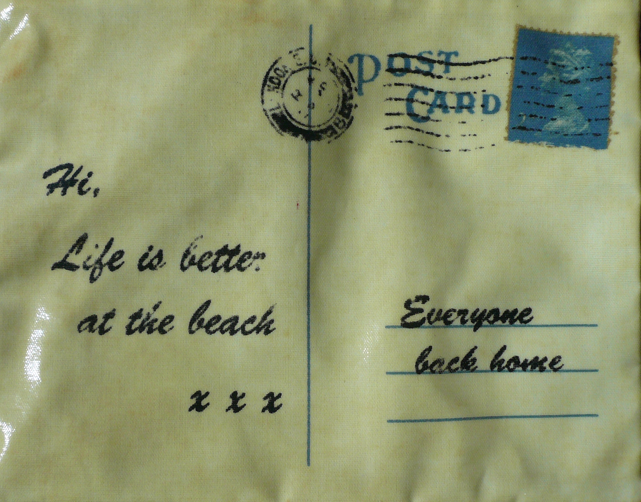
It’s been one whole year since we started this blog and if we could, we would share cake with you all. C’mon over again soon!
It’s been one whole year since we started this blog and if we could, we would share cake with you all. C’mon over again soon!
A kelpie is a Scottish water spirit, who usually appears as a horse. But Andy Scott’s Kelpies are a pair of sculptures that since April 2014 have stood 30 metres above the entrance to the Forth and Clyde Canal in Falkirk, Scotland. You can glimpse them from the road nearby, but that doesn’t really do them justice. Up close (and you can walk right up to them and even, on a guided tour, inside them) they are spectacular.
Andy Scott is a Scottish sculptor who specialises in public art and his work can be seen in England, Northern Ireland and Australia as well as Scotland. The Kelpies’ maquettes (smaller, preliminary works – in this case 1:10 scale) have also been exhibited in the US, most recently in Bryant Park, NYC. Interestingly, he was given the title ‘The Kelpies’ to work with right at the start of the project, rather than it being something decided retrospectively. Andy then developed the idea from its beginning in mythology to something which encompasses the idea of the horse as the driving force of the early industrial revolution – including of course the heavy horses that pulled the canal boats when the canals first opened. (Two Clydesdale horses called Duke and Baron were the actual models.) Each sculpture weighs 300 tonnes and is made of 990 stainless steel plates.

The Kelpies are not without their detractors. Jonathan Jones writing in The Guardian (22/4/14) called them ‘banal and obvious’, saying that they are ‘neither well observed nor powerfully imagined’. But if we may be so bold (and you know that we are not usually controversial), we think that he is missing the point as he sees them as sculptures of horses. But they are not horses, they are kelpies and they say something about our relationships with water, earth and industry. We think they do it very well indeed.

We’re not usually big fans of graffiti. That’s partly because although everyone has the right to self-expression, everyone else has the right to a) not be interested and b) not have their property damaged. And it’s also because for every Blek le Rat there are a gazillion people who aren’t making urban art statements, but just have a spray can.
But a few weeks ago some uplifting graffiti appeared near us – like the example above. And this one:

And this one:

People have been noticing them and smiling, which is always a good thing. And there’s something else. As you can see, the writing is in chalk, which is very easy to wash off. But they have all been up for a couple of weeks – which, we like to think, means that the owners of the buildings they appear on have chosen not to do so. Instead they are leaving these little messages where they are to make people smile as they go about their business. And although, as we said, we are not big fans of graffiti, it’s difficult not to see the good in that. And who can complain about this one?

This week we’re having a bit of a colour dilemma, caused by our ongoing love of bed linen.
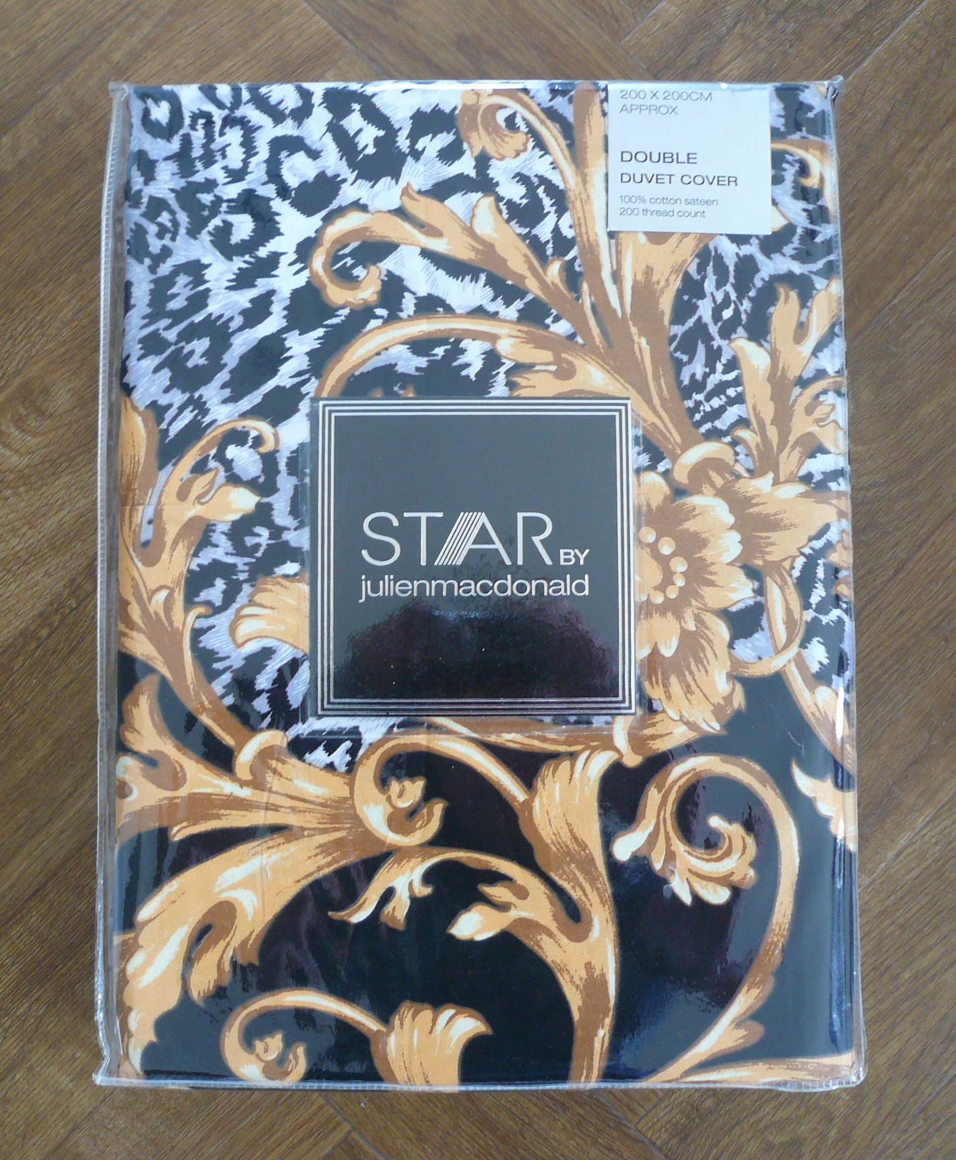
You might remember that a while ago we got some new bedroom curtains – so that’s got to be an excuse to get some new bedlinen, right? The trouble is that we couldn’t find quite what we were looking for. There were lots that were lovely but nothing quite right. We were trying for something that had a kind of tongue-in-cheek, old school glamour. Maybe dark to offset the cream curtains? Maybe a bold pattern because the bed is the focus of the room? Maybe something heading towards the top even if not actually going over it? And then we saw this (and then, like you’d expect, we waited until the sale to get a bargainacious 50% off).:
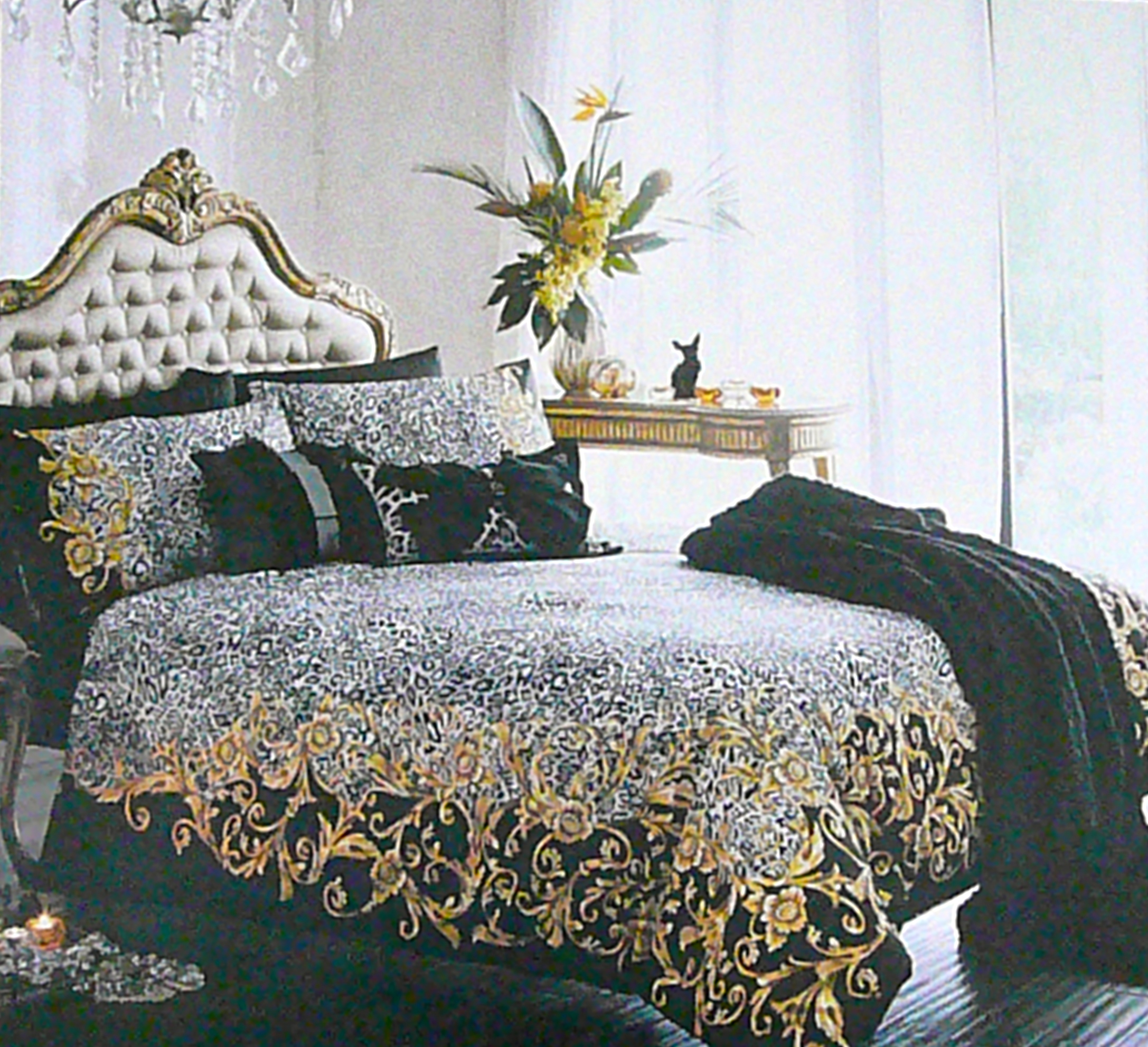
So that’s the cover sorted, but here comes the dilemma – what colour sheets? In the picture the sheets are black, but aren’t black sheets a little… Austin Powers?
Embed from Getty ImagesEach to their own an’ all (and it was a great movie) but that’s not quite the look we want.
So what colour? As a general rule, you can’t beat white sheets but we think white will look too stark.
So what colour? As a general rule, you can’t beat white sheets but we think white will look too stark. Yellow? Hhhmmmm. Maybe it’s time for a lie down while we think about it. We’ll let you know what we decide!
Yes, it’s late spring/early summer and that means that our favourite flowers, peonies, are in season again. We bought these amazing single ones the other day:  Apparently, peonies were introduced to northern Europe by Benedictine monks which is why they are sometimes referred to as ‘Benedictine roses’. This one is a candle:
 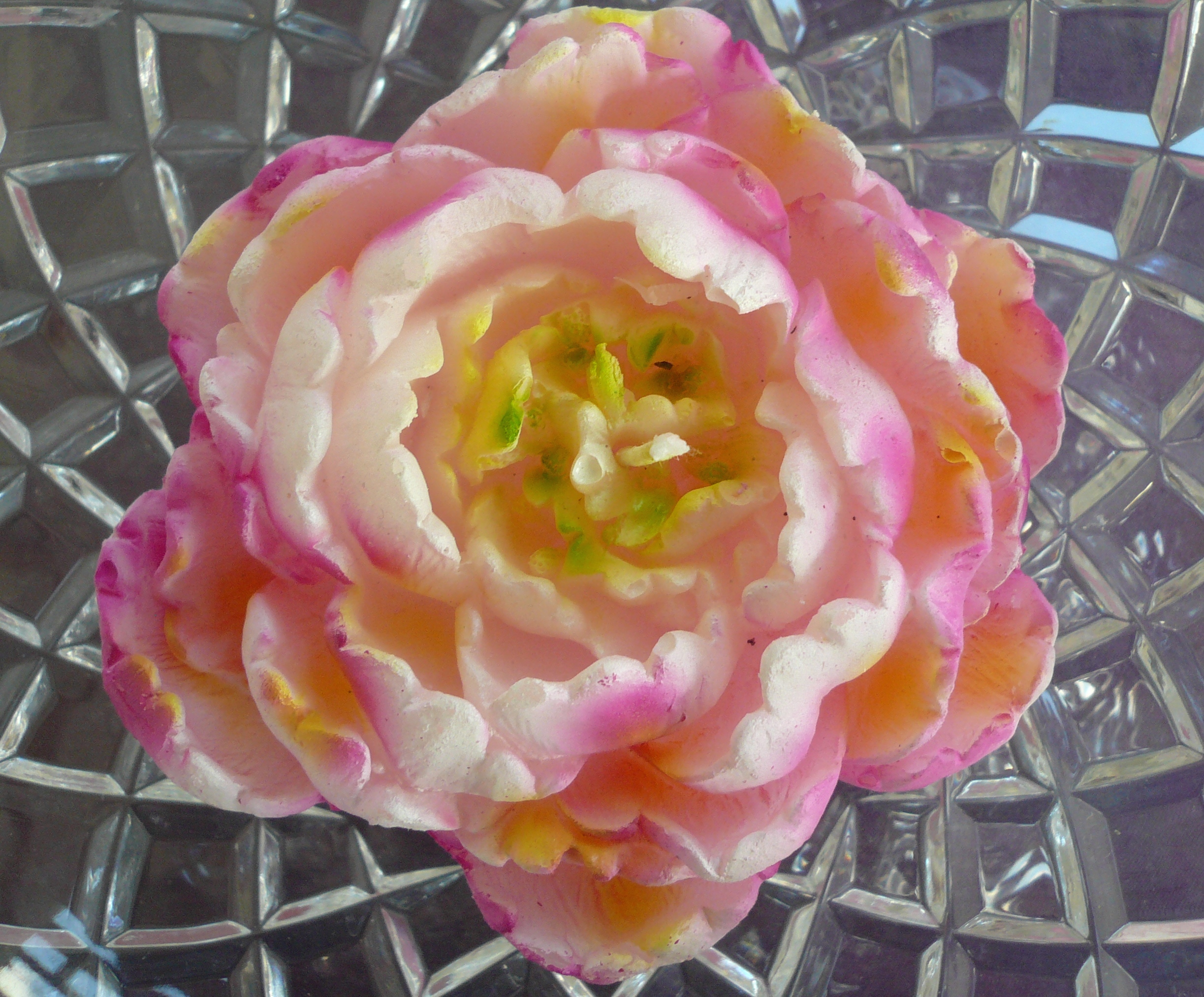 But that’s a problem – should we actually burn it? ‘Once it’s gone, it’s gone’ as Granny used to say. On the other hand it won’t look very pretty if it gets all dusty… maybe we just need to find a really special occasion and use it then. Any excuse! Maybe the beginning of summer is a good enough excuse anyway?

Do you remember Cecelia? The Dan Hillier print we bought a while ago? (Here is a link to the post about it).

Well, we finally got round to taking her to the framing shop.
First step was to chose a mount – easier said than done. Our first thought was that it should be a pale grey, but in practice all the greys were too dark and actually looked more like blues against the print. Luckily the shop had a range of different colours:

But even opting for white mean that there were still decisions to take – some of the whites looked too yellow or too pink against the print. And the one that was the brightest white…well, it looked too white! Eventually we chose the one on the left in this picture:

That one is called ‘French White’, which has a suitably sophisticated ring to it! (Please note that it is not Ice White, Goosedown, Polar White, Spanish White, Matte White, Igloo, Frost, Fairfield White, Cobblestone, Almond or Photo White – and those are just the ‘white’ colours from the same manufacturer. There are others, with different colours of white mount card!
But the colour of the card wasn’t the only decision to be made about the mount. We also had to decide whether to have the print window mounted, or float mounted. Window mounted is the more traditional of the two – the print sits behind the mount, which has a ‘window’ cut out so that the print can be seen through it. Float mounting puts the print on top of the mount so that the edge of the print is visible. It’s usually used with a box frame so that there is some physical depth to the finished picture. We went for window mounting for two reasons. One is that the edge of the print is just a straight cut and not particularly interesting in itself. The other is that Cecelia’s headress (or is it her hair? Or her feathers?) fills the top of the print and we didn’t want to take away from that affect. That’s also why we chose to have the mount go straight up to the edge of the image rather than leave a few millimetres of the paper outside the print showing. The borders will be slightly narrower at the sides than they are at the top and the bottom.
So finally, the frame. Once again, there was quite a choice:

The plan was to get something plainish, but not too plain, with a silver-gilt colour. With some help we settled on this one:

So that’s all the decisions made and now we just have to wait 7-10 days until she is ready for collection. Thank you very much, Framework Picture Framers, for all your help and advice!
We might have mentioned before how much we love House of Hackney wallpaper so we’re very excited that they have a new collection out called ‘Art Deco Menagerie’, which is made up of animal prints on striped backgrounds. There are its of animals to choose from but this one is our absolute favourite:

It’s called ‘Baleana’ and this colour way is cream and Aegean blue. This would be so gorgeous in a bathroom… (redecorating the bathroom twice in 18 months is OK, isn’t it? If the wallpaper is really lovely so it’s not like on a whim or anything?)
We also love Flamboyance, which is a flamingo pattern (this colour is off white/macaroon pink:

And Pride, which isn’t lions but ostriches (blush/off black):

There’s also Prowl, which is a cheetah pattern (clay/black)
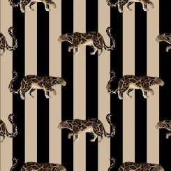
There are also monkeys, zebras, giraffes – all in a range of colours. You can see the full range here. And House of Hackney are donating 5% of the proceeds to the Born Free Foundation, an international wildlife charity, so you can do good while your walls look good!
(Please note that all the pictures in this post are from the House of Hackney website, so they own the copyright to them – you know how we like to be clear about these things.)
Embed from Getty Images
What colour is this flower? It’s yellow, right? We thought so too! But we heard something mind-blowing the other day. Did you know that ‘pink’ used to mean ‘yellow’? Us neither. How can pink be yellow? Apparently, it’s because there is a German word ‘pinkeln’ which means to urinate (we know – this isn’t the kind of thing we usually talk about). In the past, walls were often covered with distemper, a kind of whitewash, which could be coloured. The distemper was sold in powder form and mixed up when needed – except for a yellow colour, which was sold as a liquid, hence being associated with ‘pinkeln’ and so ‘pink’. This was convenient and popular but over time, the most popular colour became a kind of pale red and the name stuck. There is also an artists colour called ‘Dutch Pink’ which is a light greenish yellow. In more recent times, ‘pink’ as a description of a colour is generally thought to refer to the flower dianthus, which is also known as a pink. They became popular in the seventeenth century, round about the time that the word pink became generally linked with the colour we associate it with now.
Embed from Getty Images
And something else we didn’t know – when people in the plastics industry talk about PVC ‘yellowing’ they don’t necessarily mean that the PVC has gone yellow because ‘yellowing’ can show as several colours, one of which is pink! (And this is not the same as ‘pinking’, which also turns the PVC pink but which results from a specific manufacturing process. We read these things so you don’t have to.) Oh – and maroon used to mean brown, not red. And auburn used to mean brownish white rather than reddish brown. Don’t even try and guess what blue used to mean…
You know we are all about lovely things – sometimes ‘lovely’ is in the eye of the beholder.
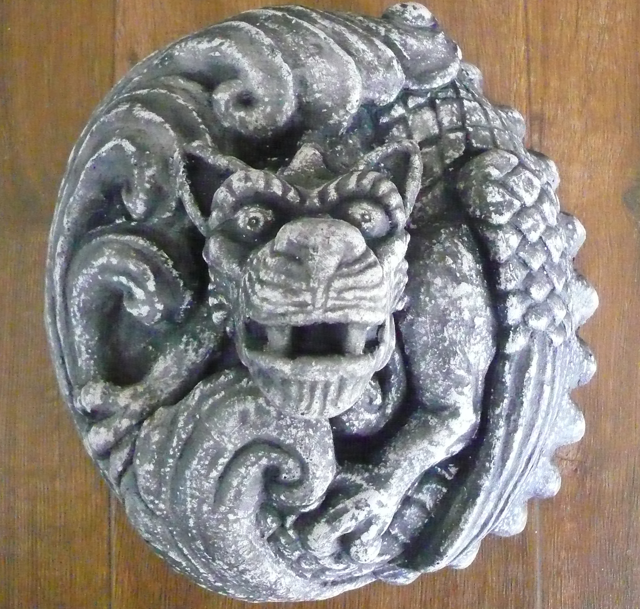
This is Magz the Guardian Dragon. She’s based on a pair of dragons that guard the doors of St Margaret’s Episcopal Church in Leith, Edinburgh. And she’s made by a company called Gravely Gorgeous, which produces wall art based on gargoyles and grotesques found in Edinburgh. They make them from jesmonite, which uses real stone to make a composite material which looks like stone and is safer than fibreglass and lighter than concrete. Jesmonite is also suitable for outdoor use – and Magz is destined for a wall in South Yorkshire (we hope she enjoys the move south of the border and doesn’t feel the need to breathe fire on anyone).
The man behind Gravely Gorgeous is Philip Obermarck, a visual artist and sculptor who was born in the US but now lives in Scotland. A lot of his work other than for Gravely Gorgeous has quite a dark aspect to it, but Magz looks quite friendly – for a dragon.
Gravely Gorgeous sells online and ships internationally.