Staunch Industries

We haven’t posted for a while – there’s been a lot going on! And one of the fun things* was that we discovered Staunch Industries.

IMG_0757

Now you know with us it’s more about the great indoors than the great outdoors, right? These guys couldn’t be more different. Staunch Industries is a design-led lifestyle brand that’s all about celebrating the ruggedness of the North Sea and the wild places of Scotland.

As well as producing some amazing design work for their clients all over the world, they sell a variety of products through their website, including clothes, accessories and homewares. (There is also some amazing wallpaper coming soon). Here are some of our favourites:


tt_2
‘Kelpie’ tea towel
wildlife_cw_1_3
‘Wilderness’ card and gift wrap
pouches0_1
‘Salmon and Trout’ utility pouches
img_0406
‘Sea-life candle’ scented with sea salt and coconut

You’ll have noticed that those last four photographs are too good to have been taken by us – you know us so well. All copyright belongs to Staunch Industries.

We love the designs – maybe it’s time to be more outdoorsy with the indoors!


*One of the other fun things is that last month we turned two years old!

New purchase for summer!

We’ve had to wait several weeks for them to come into stock, but our new purchase for the garden is finally here! It’s one of these:

IMG_0629


It’s called a Lamzac Hangout and it’s a large, easily inflatable, outdoor seat. The idea was first presented on the Dutch version of The Dragons’ Den and is now made by a company from The Netherlands called Fatboy. Fatboy have been making innovative and hard-wearing products for the home,garden and general and outdoor living since 2002 – check out their website for other great ideas. Here is the promotional video for the Lamzac Hangout:


We thought that looked like a great idea and couldn’t wait for ours to arrive! To be honest, it was a bit harder than the video suggests to fill, but there’s probably just a knack to doing it so quickly. As you can see from the video, it’s the right size for one person to lay on but two or three can sit on it comfortably. It’s very comfortable when it is inflated and it’s very easy to deflate and pack into its carry bag.

IMG_0630.jpg

It only weighs 1.2kilos, so is easily carried (we’re planning on taking ours to the beach when the weather gets a bit better).

Incidentally, there are a few copycats on the market but this is the original, and is made from harder wearing material, which is why it is more expensive. Thinner material is more likely to tear on uneven ground and turn out to be a false saving in the long run.

Now to get back to the lazing…


The art of a tea towel

IMG_0912


You probably know that we have a weakness for a tea towel – so we were delighted when this extra-special one arrived in the mail! Why is it extra-special? Well…

First of all it was sold to raise money for the Save Norton Folgate campaign. We’ve posted about Norton Folgate in the past here and here. (The latest is that the former Mayor of London’s decision to overrule Tower Hamlets council and allow the British Land development to go ahead has gone to a judicial review and a decision will be made very soon).

Secondly, the design is by Adam Dant – who is sometimes called ‘the 21st century’s Hogarth’. He creates large, intricate drawings that record and often satirize contemporary life. (He was the official artist of the 2015 General Election.) And as a Shoreditch  resident himself, he has keen interest in what happens in the area. The tea towel features a print of his work ‘The Curse of Norton Folgate’ (created especially for the Save Norton Folgate campaign), in which the animals that died in the fire at the East London Aquarium, Menagerie and Waxwork Museum in  1884 stalk the streets of Shoreditch delivering elaborate, theatrical curses to those who wish to despoil the Liberty of Norton Folgate.

IMG_0923

They are surrounded by vignettes of the history of the area and portraits of famous residents:

IMG_0914


IMG_0922

And the third reason it’s special? These tea towels were sold as a limited edition of 100 and are numbered and signed! So it’s not so much a tea towel as a bona fide piece of art, which means that we couldn’t possibly use it for drying dishes… and anything that means we don’t have to dry dishes is A Good Thing!


PS Sorry – they are sold out!

Marthe Armitage and Helen Morley

When you think about it, it’s such a shame that we use the term ‘wallpaper’ to mean not just the physical wall covering, but something bland and unnoticed in the background. There’s ‘wallpaper’ and wallpaper – and each piece of handmade wallpaper is a genuine piece of art in itself.

If you follow us on Facebook – and you do, right? – you will have seen that we recently shared a video about Marthe Armitage. She is a British wallpaper designer who has been hand-producing beautiful lino-printed wallpapers on the same equipment since the 1950s. Here’s the video again.

Marthe is inspired by the natural world but her drawings have a magical,absorbing quality about them. Some, like Marrow, are fairly straightforward representations of foliage and flowers:

Screen Shot 2016-04-30 at 15.11.07


Others, like Gardeners, contain figures:

Screen Shot 2016-04-30 at 15.14.23


Some are entire scenes, like this one (Italian Garden):

Screen Shot 2016-04-30 at 15.16.31


And some of them are not just scenes, but entire little worlds, like Tiger Moth:

Screen Shot 2016-04-30 at 15.19.32


Or Windmills:

Screen Shot 2016-04-30 at 15.21.58

All Marthe’s designs are available through Hamilton Weston, who are specialists in historical and bespoke wallpapers.

By coincidence, there is an article in this month’s Homes and Gardens magazine about Helen Morley, another handmade wallpaper designer who names Marthe Armitage as ‘the person who really inspires me’.

IMG_0906

Helen has a background in botany and conservation, as well as art and all her wallpapers start of as botanically accurate drawings. The latest is the very beautiful Peony Rose:


6186503


You can see – and buy – Helen’s designs on her website Waybreads.com (it’s an old name for an Bristsh native plant). The site also has a beautifully written and amusing blog about the design and manufacture process.

All these amazing handmade wallpapers are about as far from ‘wallpaper’ as you can get – there is nothing bland or unremarkable about them. There’s just one problem. We don’t have enough walls…


Time for tea

The other day we visited Mimi’s Picnic Parlour in Edinburgh (an offshoot of Mimi’s Bakehouse) – isn’t that a great name for a coffee shop? It only has three tables because it specialises in cakes to takeaway, hence the ‘picnic’ bit. And the cakes (and the blondes and the brownies and the tray bakes and the scones…) are amazing. You can check them out here, as well as the delicious savoury goodies, and be thankful that calories and carbohydrates can’t travel through the internet!

Anyway, although it is a very small space they have decorated it in a charming and slightly eccentric style, in keeping with the other branches. First, there are two of these delightful light fittings:


IMG_0824

IMG_0857


As you can see, they are wire lamp frames which have been decorated with little birds. You can also see that there is no actual bulb in there – probably a good idea from a safety point of view if you were thinking of having a go at making something like this, so you’d need to make sure that fitting wasn’t actually needed as a light source. Here there is a large window and some recessed spotlights in the ceiling.

There is also this wallpaper:

FullSizeRender


It’s by Dupenny and is called ‘Time for Tea’. It’s a wallpaper that grabs the attention and as Mimi’s Picnic Parlour is small, they have wisely used just one panel of it so it doesn’t dominate the space. (It’s also positioned rather discreetly so that it can’t be seen from that large window we mentioned)!

So the clever ideas don’t just stop with the baked goods! If you are in Edinburgh and fancy dropping in to sample the delicious food served by charming staff,  you can find Mimi’s Picnic Parlour at 250 Canongate, Edinburgh, EH8 8AA.

Super Supermarket find

You won’t believe where we found these cute mugs …

(OK so there’s a clue in the post title but you can let us be excited, right?)

They weren’t from some obscure specialist retailer of lovely household things – they were from Sainsbury’s! And they only cost £2.50 each! If that isn’t enough, you can include them in an on-line shop and have them delivered to your door with your groceries.

Now you can see why we were excited, maybe it’s time to have a cup of tea and calm down.

P.S. – Copyright in the photos belongs to Sainsburys!


A bright idea


G95-hanging-cropped.jpg

A couple of weeks ago we came across a brilliant idea from William & Watson, who rather than being two people is actually a team of creative artists who have some great lighting ideas.

FullSizeRender.jpg

On their site you can find beautiful, handmade, vintage-style filament bulbs and some similarly styled LED bulbs that use 1/10 energy of a traditional light bulb but have a life expectancy approximately 10 times longer. They also sell lamps, bulb holders, ceiling roses and beautiful fabric and metallic cables in a range of colours. The bulbs are all compatible with dimmer switches (which William and Watson also sell) which gets round concerns about them begin too bright, or in the case of the filament bulbs, getting too hot.

So  that makes the bulbs beautiful and practical – hard to beat a combination like that – and even better, the site has a blog with some great lighting ideas. Well worth a look to inspire some lightbulb moments!

mail-1.jpeg
The bulbs look great hung in a group


purple-247x300.jpg
Beautiful purple fabric cable (there are its of other colours too)


T30-200mm-3W-LED-william-and-watson-industrial-vintage-retro-edi-copy1-247x300.jpg
Tube shaped LED bulb

Many thanks to William & Watson who let us use their lovely photos!

So. Pastels.

It’s clear that pastels are a thing at the moment – Pantone has named not one but two as ‘colour of the year’ and when we talked to Rebecca from Georgia Victoria a couple of weeks ago, pastels were one of her tips for the coming year. But you know what? We’re kind of on the fence for this one.

For the first year ever Pantone has chosen a blending of two colours as ‘colour of the year’ – Rose Quartz (described as an ’embracing rose tone’) and Serenity, a ‘tranquil blue’.

press_coy2016

They are described as ‘a harmonious pairing of inviting shades that embody a mindset of tranquility and inner peace’ and, according to Pantone, reflect a yearning for reassurance and security in response to the stress of modern living.

Well, they are certainly pretty colours. And can be very useful for decorating – either pair well with greys, greens, plums and beige-y neutrals. Neither of them is difficult in the sense of demanding attention or draining life from other colours. Few people will have a passionate dislike of either.

And that’s the problem really. They are a bit safe. Now usually we are all for safety (and please watch that coffee pot, it’s hot!). Safety is good. A healthy respect for safety is how our ancestors didn’t get eaten by sabre toothed tigers. And our homes should definitely be safe places. But we can’t help feeling that our homes should be safe so that our imaginations can take some risks. It’s OK to pick a bright colour; choose a dramatic fabric;  surround yourself with unusual objects you love!

So that’s what it comes down to really. There’s always a place for pastels, but we think you should use those safe colours with caution!


An Interview with Rebecca from Georgia Victoria

Just before Christmas we went to a party and were lucky enough to meet Rebecca, the interior designer behind Georgia Victoria. Not only was it great to meet her but she agreed to do an interview with us – our first ever! So earlier this week we finally got together for a chat.

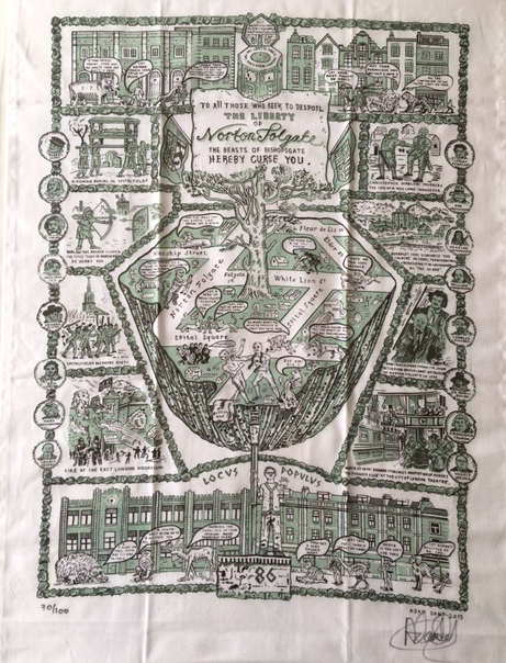
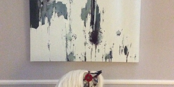
Because we are nosy, we had to ask Rebecca what her favourite decorative item in her house is and she told us all about this lovely rocking horse*.

583654_orig


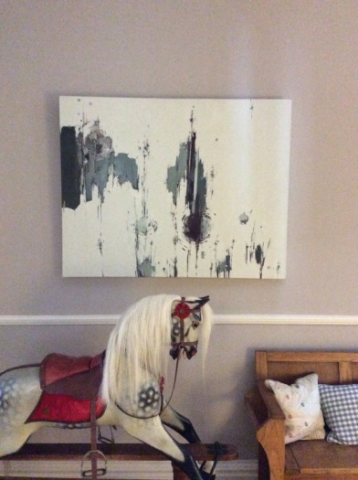
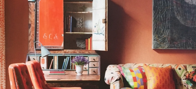
It belonged to her grandmother who bought it in the 1920s, although it probably wasn’t new then. It lived in a huge attic with a billiard table, a table tennis table and other toys for the grandchildren to play with and the rocking horse became a place to wait for a turn with the most popular toys. In due course he was renovated and Rebecca eventually inherited him from her grandmother. He now lives in her hallway and although he definitely counts as a decorative object, children – both Rebecca’s own and visiting ones – are encouraged to play on him. So what makes him special? “There are stories to tell about it – stories and memories”.

This is a key point for Rebecca’s work. She has a key piece of advice for anyone starting a design project: “have talking points to enrich the interior for you and your guests”. Rebecca thinks many interiors are ‘safe’ rather than a reflection of the people who live there and she takes pride in working with great upholsters, furniture makers and other craftsmen to create bespoke items. She recommends having confidence – chose things you love rather than things you think will work. (A case in point is that picture of the rocking horse – it’s placed next to an antique settle but look how well they work with the modern painting on the wall!) If you pick things you love then there will always be a common theme that links them and objects you love will stop an interior being bland. A house is to be lived in and should look lived in rather than permanently styled as if for a photoshoot.

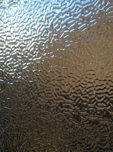
Following on from that, Rebecca believes it’s important to be flexible because interior design is an organic process. For example ‘you might plan a new carpet and then find beautiful floor boards under the old one – don’t be afraid to polish the boards, buy a rug and change the plan!” There is a great example of this on the Georgia Victoria website – a client renovating a Victorian bathroom grew to love their original figured rolled glass window par and decided to keep it rather than replace it with modern frosted glass.

9386498-1


Rebecca herself loves Victorian interiors, because there is always something to look at, and one dream project would be to renovate a complete Victorian townhouse from top to bottom for a client who wants an interior ‘full of silk and drama”. But what about her own dream? A bothy! It would be a retreat away from modern city life and electricity; a calm, serene space to connect with nature. And it’s not surprising that she dreams of something simple – the last year has been very busy for Georgia Victoria. The client list is growing (both private and corporate clients) and exciting projects for the future include fitting out a horse-drawn carriage!

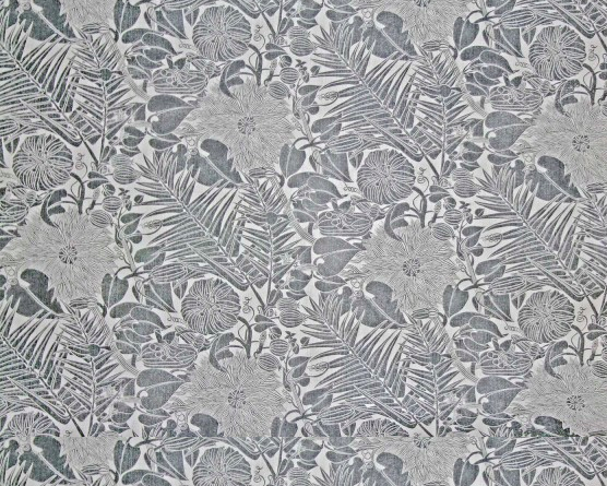
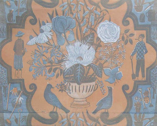
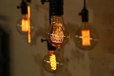
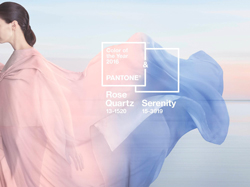
So what interior design trends should we all be looking out for in the coming year? The three Ps – pastels, patterns and plants. Rebecca thinks that all the grey interiors that were so popular a few years ago will now need a refresh and that pastels are the perfect way to achieve this. In a similar vein, as we get bored with blocks of colour we will turn towards bold, patterned fabrics (check out the Georgia Victoria Facebook page for ‘Fabric of the Week’ recommendations). And plants, because as Rebecca says “Everybody needs more plants!”

If you have a design project you would like Rebecca to help with, you will find contact details on her web page.


*You’ll have guessed we didn’t take these photos, right? Copyright in all photos owned by Georgia Victoria.

‘Every Room Tells A Story’

Recently we were lucky enough to be given this lovely book, which just came out in November:

IMG_0626

Kit Kemp is an award-winning designer who co-owns the Firmdale group of London and New York hotels. This is her second book, a follow up to ‘A Living Space’ and reflects her belief that “A great space need not be the most glamorous or luxurious – it is how personal and interesting you make it”. (Although we have to say that her spaces manage to be quite glamorous and luxurious as well!).

The most striking thing about the interiors is that whilst they don’t feel cluttered, they are packed with things that catch the eye. Ceramics, folk textiles, antiques, mud bead chandeliers, bowling shoes, wooden crocodiles and fabulous wallpaper (you know how we love a fabulous wallpaper) all exist happily together. They are sourced from artists and artisans all over the world and Kit herself has worked on collections for Wedgewood, Christopher Farr, Chelsea Textiles and Anthropologie.

IMG_0630

The wallpaper in the picture above is Nuvolette from the Fornesetti II collection for Cole & Son. The room is at the Haymarket Hotel in London.

There’s a great feeling of space in the rooms. One of the main reasons that it is possible to pull this off in combination with so many fascinating objects is the selection of a subtle theme linking adjoining spaces and discipline in the choice of the individual items. Often the theme is colour. Love the combination of navy blue and hot pink in this bedroom at the Dorset House Hotel:

IMG_0628

It’s striking and restful at the same time – which is a great combination for a boutique hotel bedroom! The lamp is just the right size for the small space and seems to disappear into the background while the purple flowers are the perfect colour. (Try imagining them any other colour and see how that wouldn’t work!)

The book also features the idyllic house in the Caribbean that Kit designed for her own family:

IMG_0627

The book (published by Hardie Grant Books in the UK) is beautifully produced and full of pictures to enjoy. Definitely our recommendation if you are looking for some new ideas for 2016!